Python Google Analytics API Over 1 mil Rows Unsampled Data + Pull Data From Multiple Profiles

How to pull large data sets with over 1 million rows from Google Analytics and avoid sampling?
How to pull the same data across multiple Google Analytics profiles?

google_analytics_python_api_1_million_rows
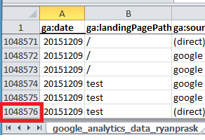
This post provides a solution for exporting more than 10,000 rows (the example pulls over 1 millions rows) and a solution for the sampling limitations of Google Analytics. The solution uses the Google Analytics reporting API and Python. It checks for the presence of sampling before running a query and gives you the ability to break your query down into smaller 10,000 row pieces. The pieces are multiple smaller queries with shorter date ranges. All the data from the small queries are stitched together and output into a single CSV file for the full date range. With this solution you can also pull data from multiple profiles using this single Python application. If you work across multiple Google Analytics profiles with high traffic volumes and often run into sampling, then this solution should save you lots of time. If you’d like to see how to use the Google Analytics Sheets Add-on to pull more than 10k rows of data and avoid sampling check out my previous post.

Continue Reading

Pull More than 10k rows Unsampled using Google Analytics Sheets Add-on

How to pull a Google Analytics report with more than 10,000 rows?
How to get around Google Analytics Sampling Limitations?

Sample Google Analytics Sheet used in this tutorial (file make a copy to edit)

google_analytics_google_sheet_add-on

Google Analytics Sheet Add-on 119,421 rows of data

How do you pull a Google Analytics report with more than 10,000 rows? How do you get around Google Analytics Sampling Limitations? These were the most common questions I was asked after my recent Google Analytics reporting API Python tutorial. This new tutorial will show you how to export more than 10,000 rows using the Google Analytics Spreadsheet Add-on and how avoid the sampling limitations of Google Analytics. I also have another post in the works on how to use Python and the Google Analytics API to avoid sampling and pull even more data. Keep an eye out for the new post!

Continue Reading

Google Analytics Reporting API Python Tutorial

• Download Python 2
Register your application for the Analytics API in Google Developers Console 
Download the Google Python API Sample Code
Google Analytics Query Explorer
Python Code to Output Google Analytics API Query Data to CSV *save file as .py

Check out this new post on how to pull over 1 million rows of unsampled data using Python & how to pull data from multiple profiles

Check out this new post on how to pull more than 10000 rows of unsampled data using the Google Analytics Sheets Add-on.

R users check out this tutorial on how to pull your first Google Analytics R v4 reporting API query.

This guide will go through step by step instructions on how to setup Python and pull your first query directly from the Google Analytics reporting API. I will show you how to install Python on Windows and add the Google API Python library. We will create a new project in the Google Developers Console and enable the Analytics API. Next we will use a prebuilt sample Python application to get data out of Google Analytics via the API. Then I’ll walk you through how to test your own query using the Google Analytics Query Explorer. Then we will edit the Python application code to create your very own query. And finally we will pull Google Analytics data directly into Excel using Python to write a CSV file containing the Google Analytics data.

Continue Reading

Format Percent Change Red & Green- Excel & Google Sheets for Digital Analytics: Tips & Tricks

google_sheet_percentage_change
If an increase is good and a decrease is bad format percent change like this
[Green]▲ 0.00%;[Red]▼ -0.00%

If an increase is bad and a decrease is good format percent change like this
[Red]▲ 0.00%;[Green]▼ -0.00%

Download Excel Sample

Google Sheet Sample

You are putting together a report or dashboard and you want to make it simple to understand changes in metrics. By adding color and arrows to a percent change you can help better visualize the meaning of the data. This post shows you how to add green and red color and up and down arrows to highlight changes in metrics in Excel and Google Sheets.

Continue Reading

Format Time on Page- Excel & Google Sheets for Digital Analytics: Tips & Tricks

• Download Excel Sample
• Google Sheet Sample

4.33 -> 04:20 Adobe Analytics
179.04 -> 02:59 Google Analytics

When you pull metrics like average time on page from digital analytics tools the number format looks like this: 4.33

I remember scratching my head the first time I saw this in Adobe Analytics (then Omniture). Was the other dot in the colon missing and did this mean 4:33 or 4 minutes 33 seconds? Or did this actually mean 4 minutes 0.33 * 60 seconds (0.33 multiplied by 60) which equals 4 minutes 19.8 seconds?

average_time_on_page_adobe_analytics

Average Time on Page in Adobe Analytics Report & Analytics

Drum roll please… it means 4 minutes 0.33 * 60 seconds or 04:20. For those of you who were able to convert 4.33 from an a number with a decimal to time in your head please pat yourself on the back and let me know in the comments. For the rest of us, this post will show how to convert a number with decimal time to minutes and seconds time formatting using Excel and Google Sheets.

Continue Reading